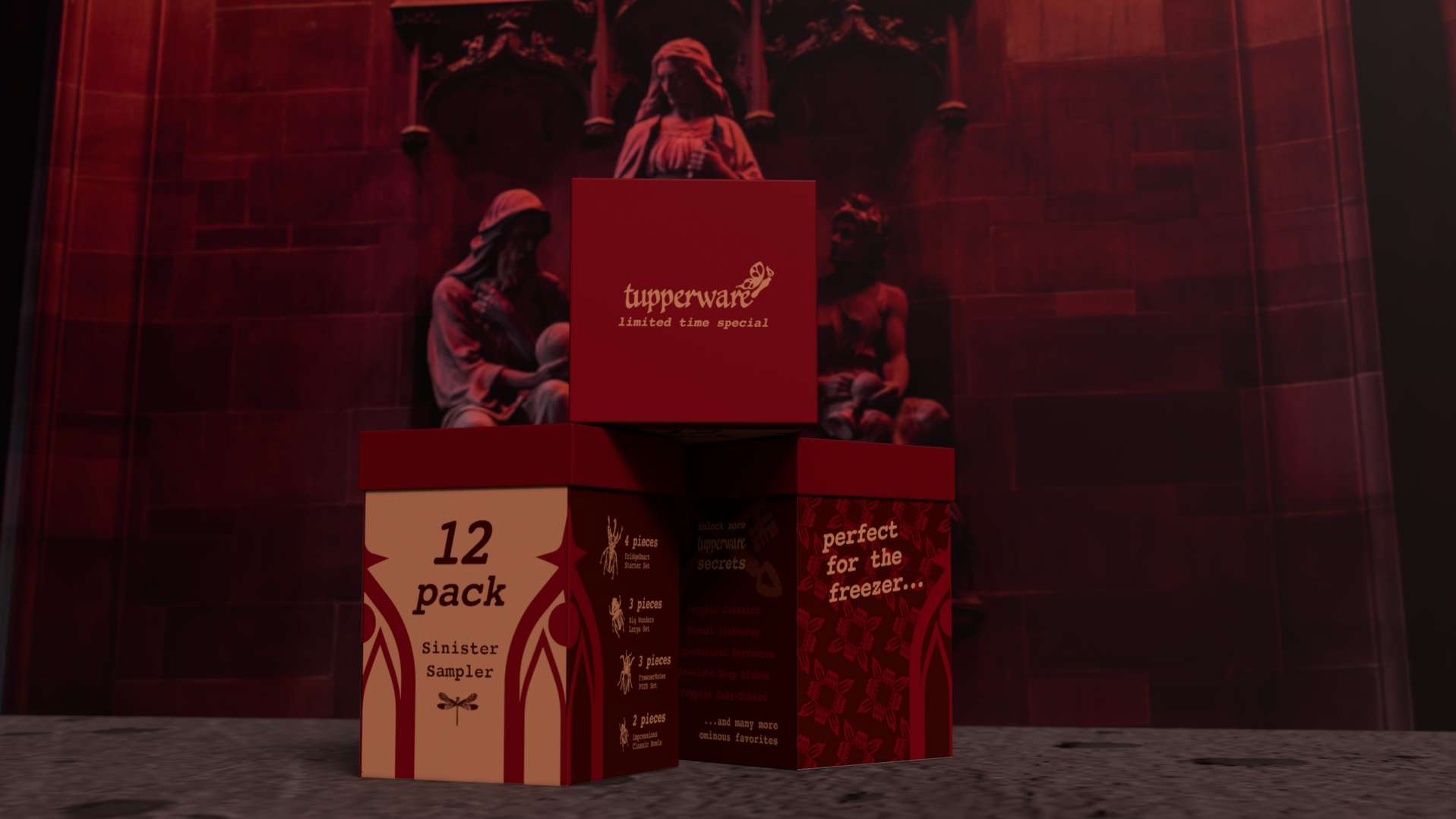
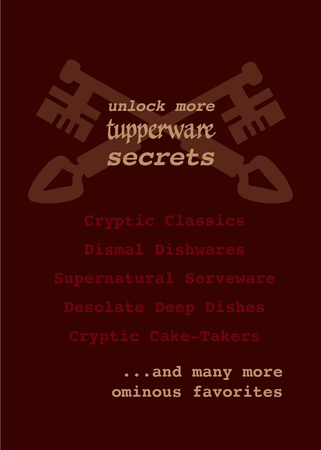
When you’re walking down the Target aisle for reusable plastic containers what do you look for? When you’re browsing Amazon what do you type in? The only product that gets put in the cart is the cheapest and most sturdy container to use over and over. It doesn’t matter what brand it is because they all present the same. Consumers are yawning at the standard white packaging with the little sleeve with broccoli and grapes around the clear plastic cubes. Tupperware needs to be the brand that jumps off the shelves, hides in the cabinet, and ices in the freezer. No longer should it be one of the companies that blends in to the point that every generic product is also called “Tupperware.” Our new redesign presents Tupperware as dark, horrific, gothic, and cutthroat (if you will). The limited edition Tupperware line includes a sample package, display advertisements, and a new logo iteration. Our audience craves a product that is different, that is scary, that has humor, and a voice that doesn’t whisper, it screams.
Packaging Graphics


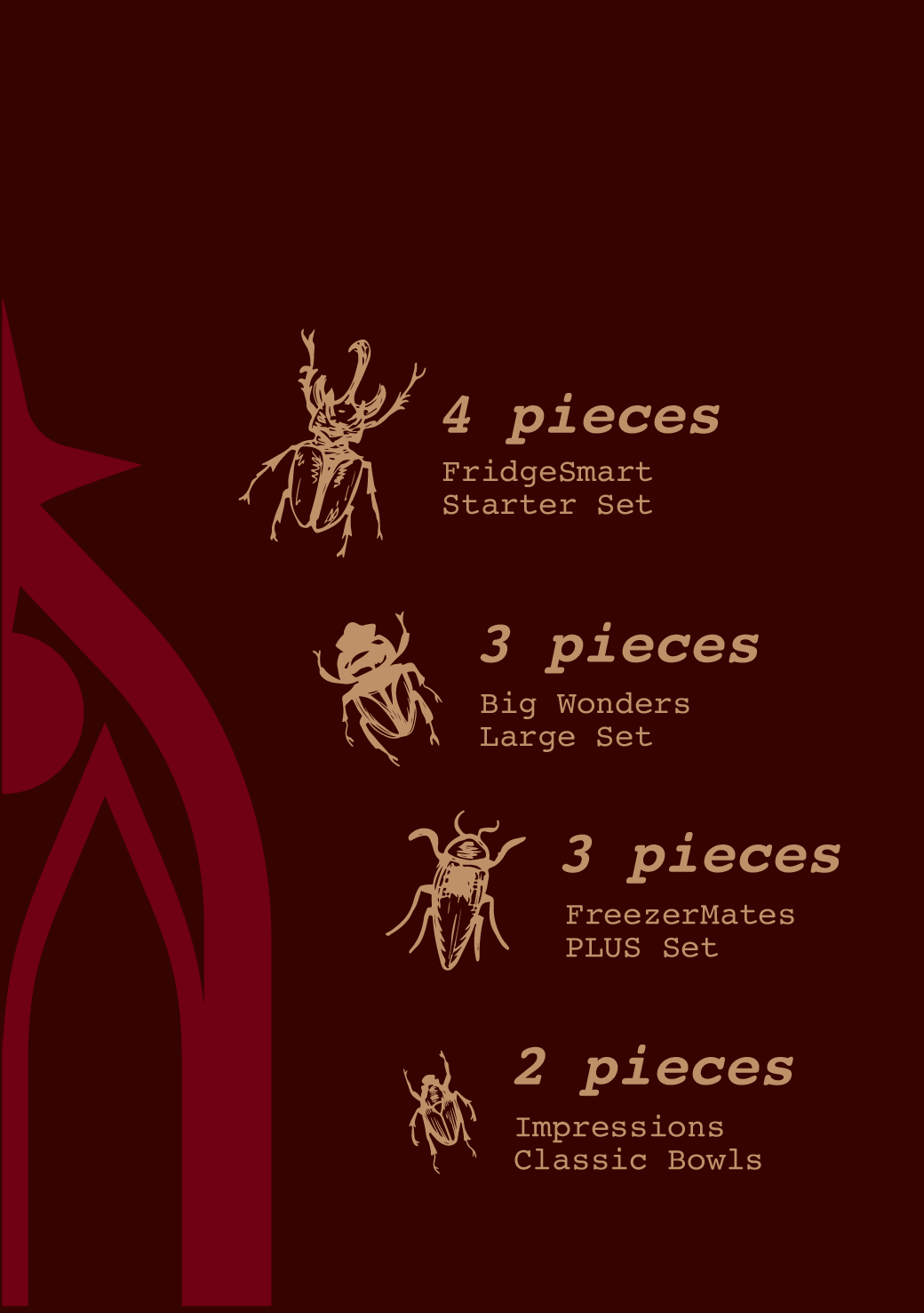
Limited edition packaging graphics.
Magazine Advertisement
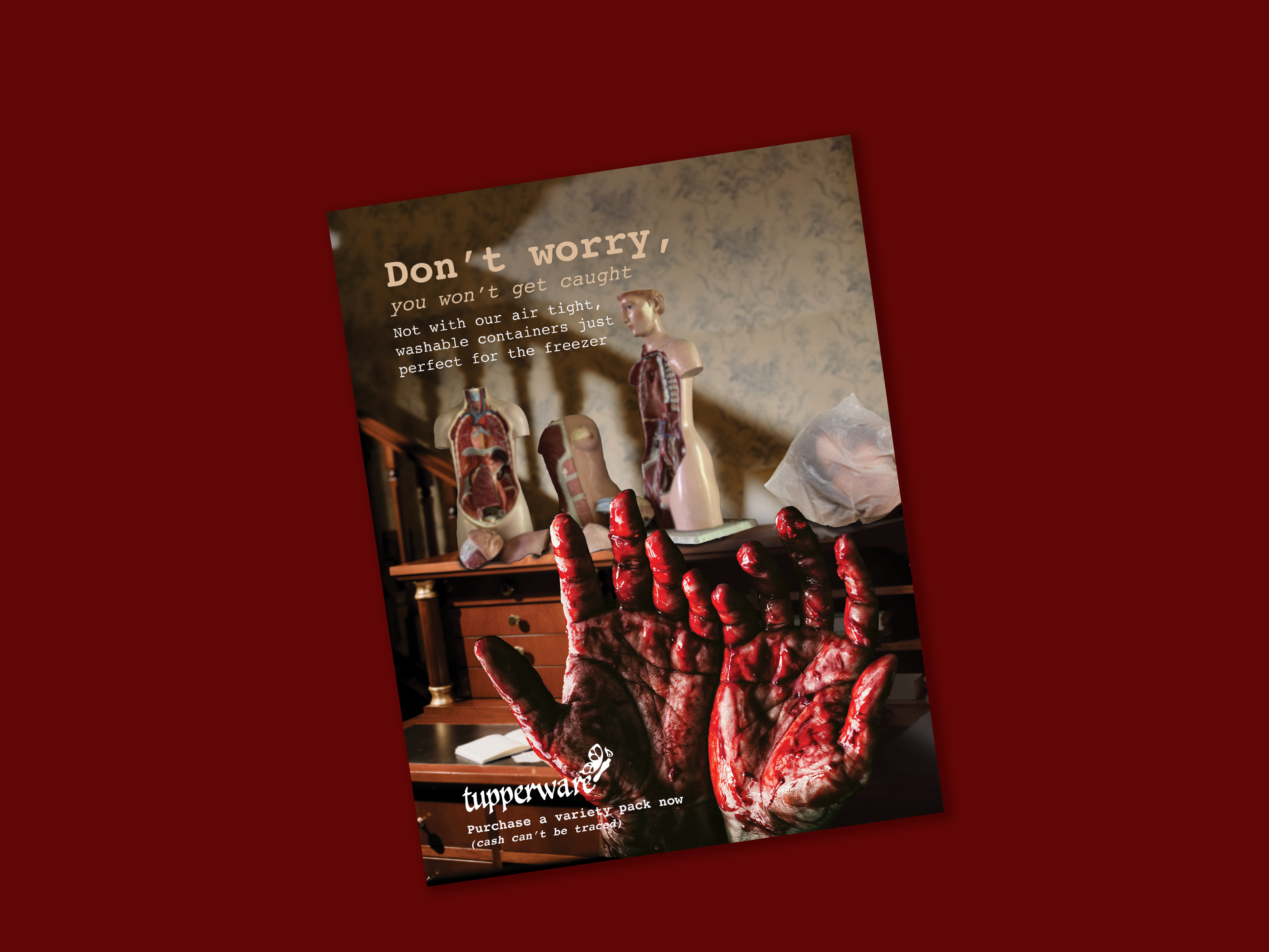
Magazine format display advertisement.
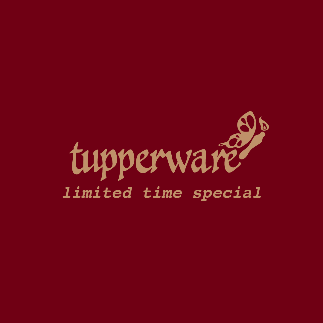
Logo Ideation
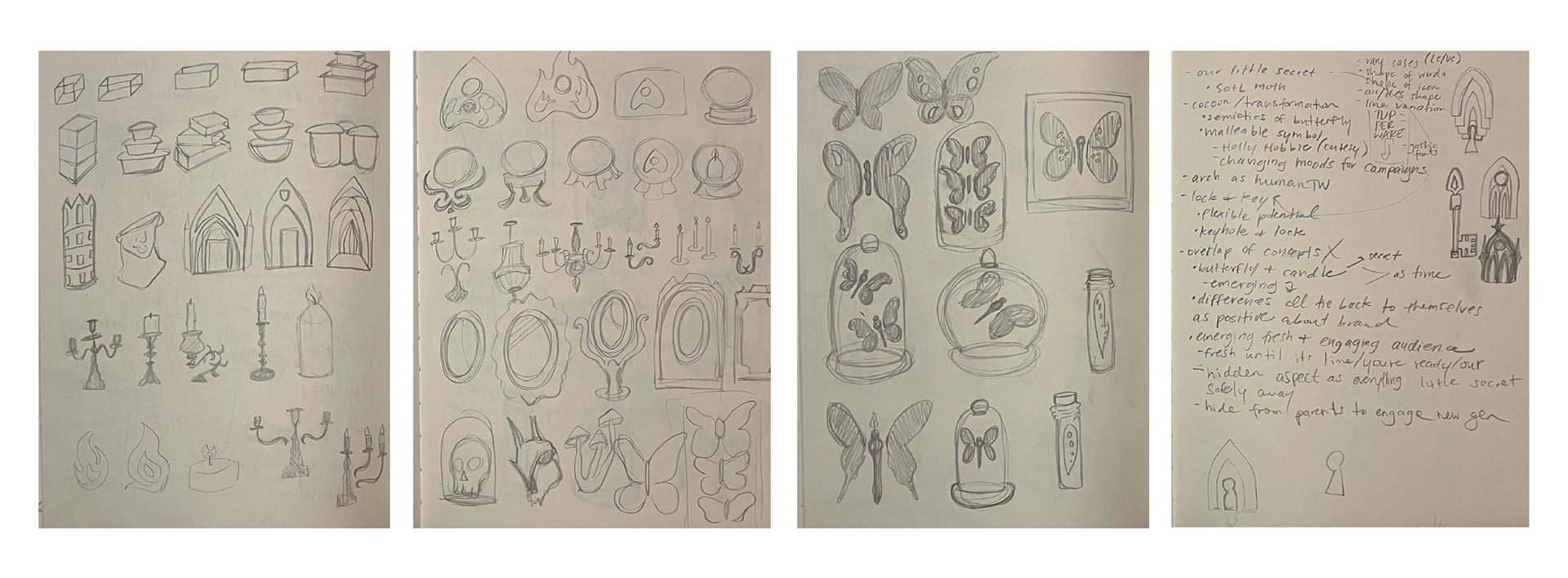

Logo sketches, notes, and final digitization.